rsms/work
The Inter typeface project
Inter is a typeface carefully crafted & designed for computer screens.
Inter is the largest side project I’ve ever taken on. So far I’ve spent four years on this with well over 10,000,000 line edits and hundreds of meetings, calls, emails and conversations with people helping out. It is a project I am very proud of and which I continue to invest in.
The idea of Inter is to design and craft a workhorse of a typeface that is accessible to everyone in the world. My dream is to provide the world with something that can help communication, independently of social or economic status.
Screen-based user interfaces are the new norm and Inter is designed to be the best possible utilitarian solution for this modern medium, much in the same way 60 years ago Helvetica was designed for physical medium.
Towards this goal Inter has been painstakingly created over thousands of hours, with a sincere dedication to quality. Tens of thousands of lines of code has been written to create tools for Inter itself. Hundreds of variations of some glyphs has been drawn.
Inter was also one of the first high-end variable fonts available when variable-font technology first came around. With a single font file you can in real-time adjust the weight and slant, accessing all 18 key designs.
You can explore the typeface itself at more depth at rsms.me/inter
Inter in the wild
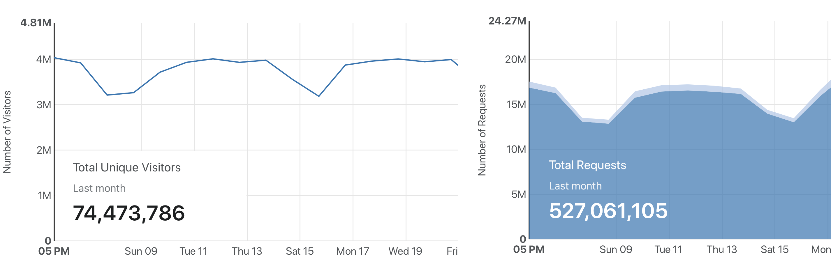
Inter’s font files has been downloaded over 400,000 times and every month the online CND serves about 500 million requests to roughly 70 million unique users. So there are a lot of people experiencing Inter every day.

Who uses Inter?
This is not a complete list but a sample of some companies & products which I think does a good job with Inter:
Figma UI
GitHub brand
Unity brand & UI
Pixar Presto UI
Mozilla brand
elementary OS
Element software suite
Images of Inter in use

Figma

Minimalissimo

GitHub

GitHub Satellite conference 2020

SB Foton Conference 2019, Sao Paulo

Unity SEC S-1 filing company summary

Unity Instagram ads

Element software suite for Matrix.org

Mozilla
How it started
Inter started out in late 2016 as an experiment to build a perfectly pixel-fitting font at a specific small size (11px.) The idea was that by crafting a font in a particular way, with a particular coordinate system (Units Per EM), and for a particular target rasterization size (11), it would be possible to get the best of both sharpness and readability.
However after a few months of using an early version of Inter, it dawned on everyone exposed to the test that this approach had some serious real-world problems. Most notably that it was really hard to read longer text. Because of the pixel-aligning nature of that approach, the font took an almost mono-spaced appearance, making it really easy to read numbers, punctuation and very short words, but eye-straining to read anything longer.
The project was rebooted with a different approach, sticking with the specific UPM, but crafting glyphs and kerning in a way that made for more variation in the rhythm and smoother vertical and horizontal stems. As Inter was being developed, it was tested on an internal version of Figma and slowly improved upon based on experience and feedback.
On August 20, 2017 I published the first release of Inter, then called “Interface”, along with the source code released under a very permissive license, making it possible for anyone in the world to use and improve upon at no cost.