rsms/work
Figma
Figma is a design tool, similar to the older Photoshop and Sketch programs I joined Figma early in its life, before there was a publicly-available product. Today Figma is a pretty big company with an impressively healthy business.
My work at Figma stretches from all aspects of design in the early days to a focus on the user interfaces and editor in later years.
Marque & logotype
Over the course of six months Johan Prag, Chris Hamamoto and myself developed a marque for the company, to be used in icons and as a logotype. Our process was wonderfully iterative.
There are two representations of the marque: Monochromatic and color.
The color variant is the primary one and is used in most circumstances, like for example for the application icon and signage focused on Figma itself.
The mono variant is used where the Figma symbol is contextual rather than at the center stage.
Concept & development
We developed a concept around “building blocks”, connecting to the playful nature of Figma and its foundation in graphic design, through the use of fundamental graphic shapes like the square and the circle, combined & attached together like you may put pieces of Lego or Meccano together as a kid.
How did we get there?
During the 6 month project we developed a new set of concepts every week which we then reviewed with stakeholders. Here below are a few slides from some of those reviews:
Examples of concept presentations
After settling on a concept and symbol, we started testing tuning it. It needs to work as an app icon, on signage, on photos, on top of arbitrary colors, etc.
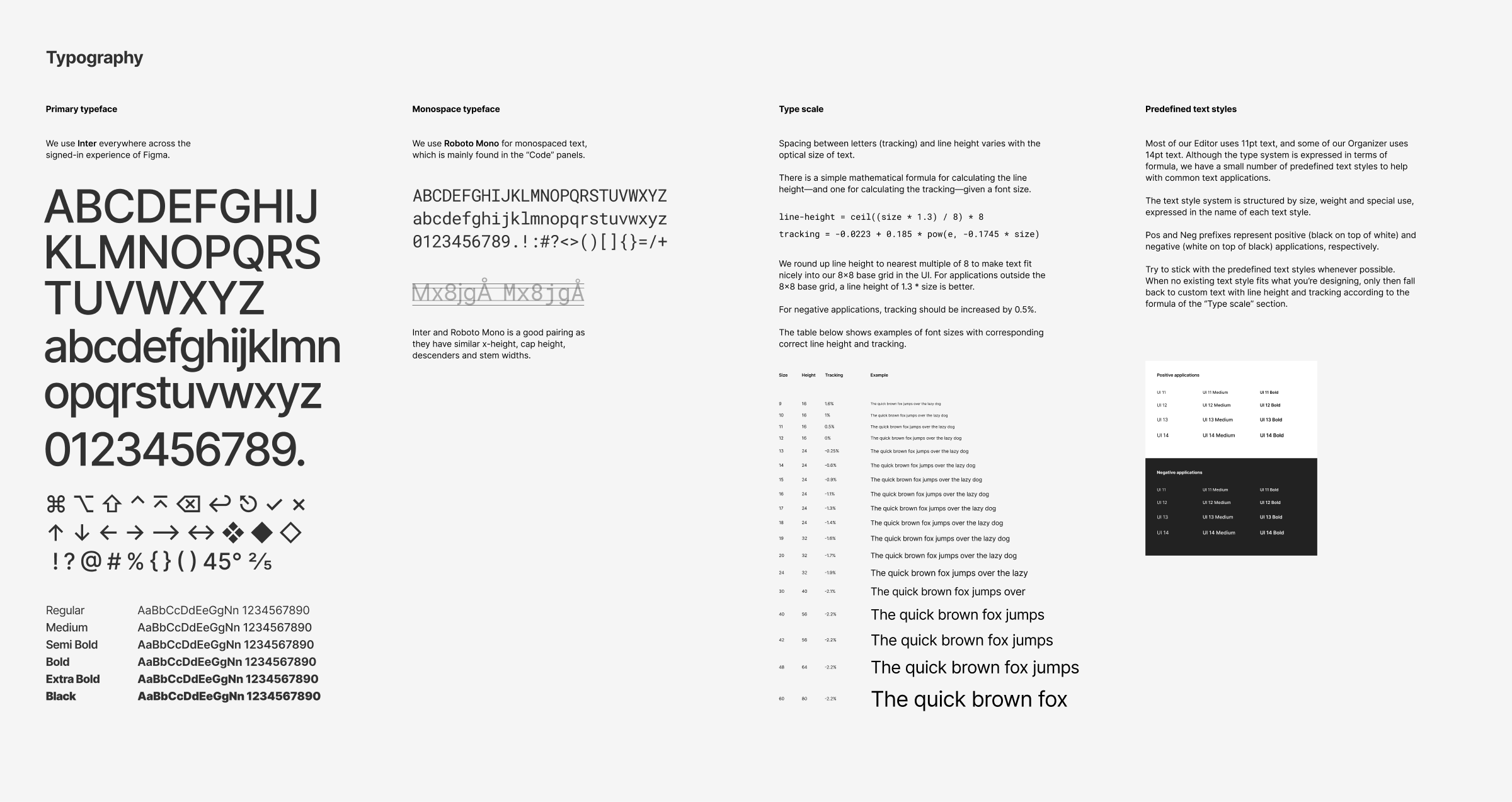
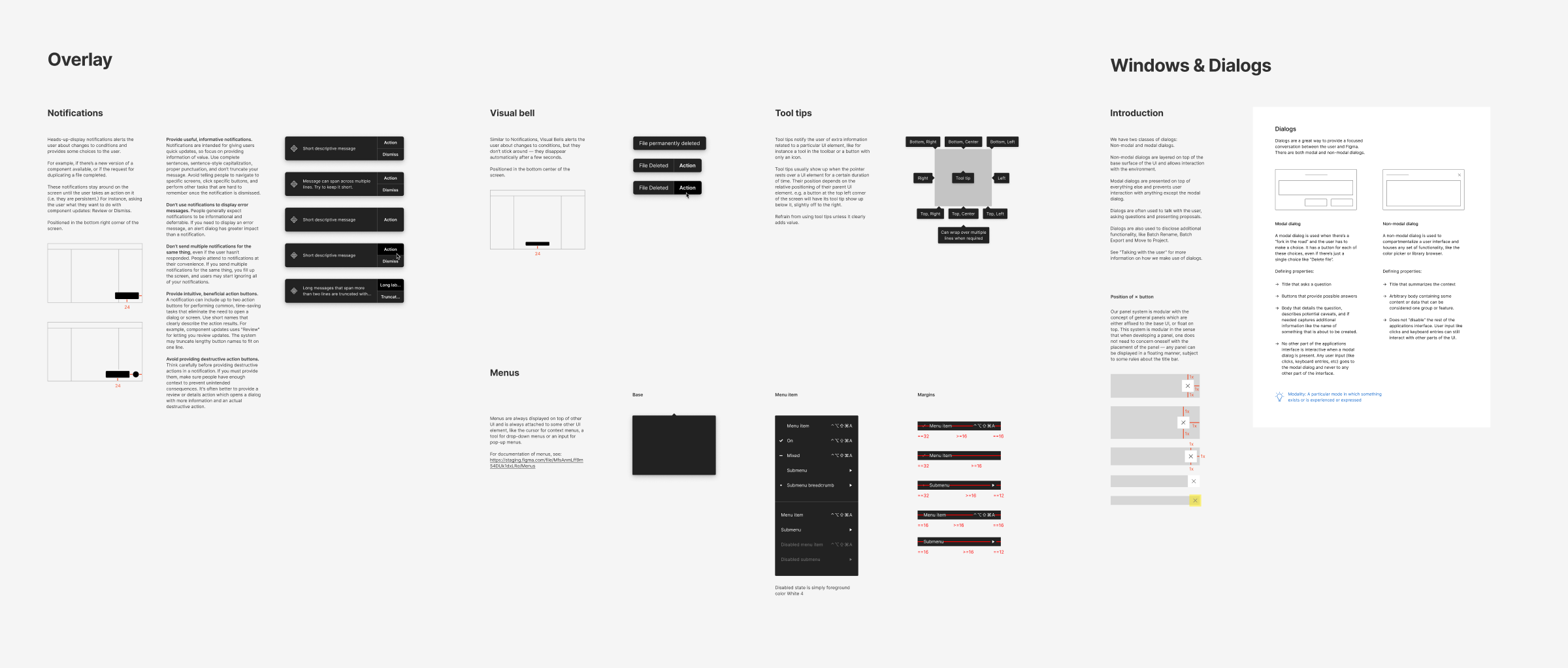
User interface
This is where you’ll find the bulk of my work with Figma. The complexity of a professional design tool like Figma is deceptively high. Behind every element of the user experience lies days, weeks or even months of deeply involved product development involving a large group of people.
At the time of writing this, late 2020, the Figma app can be divided into two major surfaces:
-
Editor — where you view, edit and share your designs.
-
Browser — where you manage your files, projects, teams and account.
Let’s have a look at the Editor:
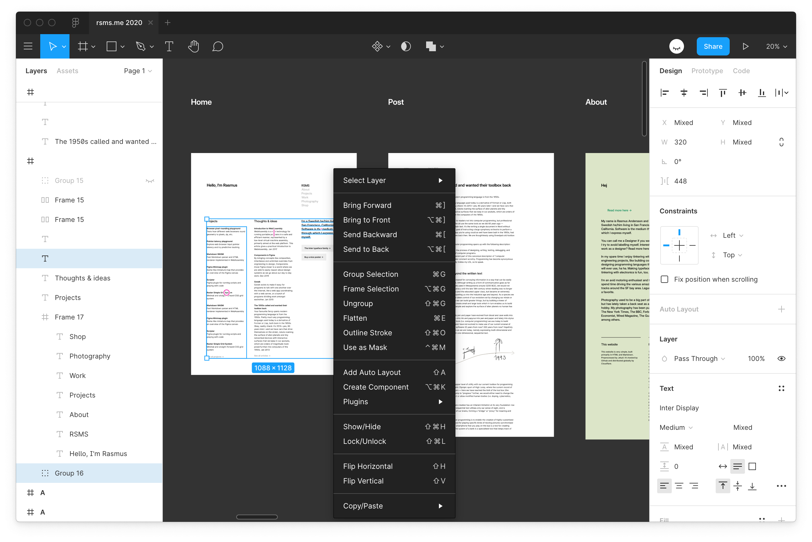
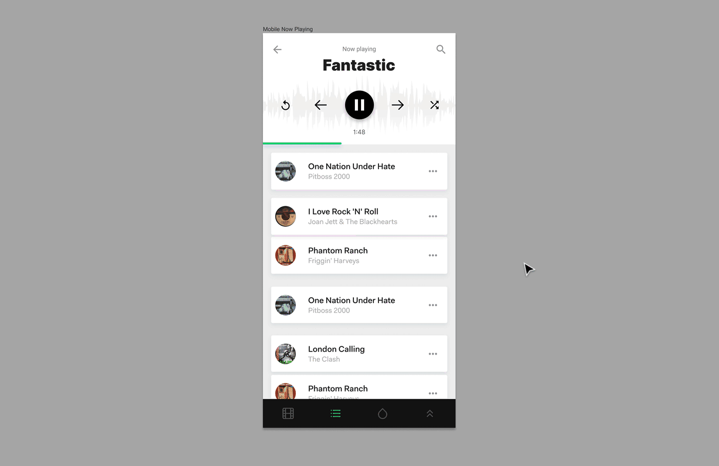
Editor
The Editor is the most complex, with several parts to it which you normally don’t see or experience until some certain condition is met. For example, if you don’t have edit permissions to a file you will get a slightly different UI and slightly altered canvas tools and interactions, tuned towards inspection and feedback. There is also a version history browser, sharing & permissions configurator, library publishing UI, community publishing UI, shared library browser, plugin development UI, and so on.
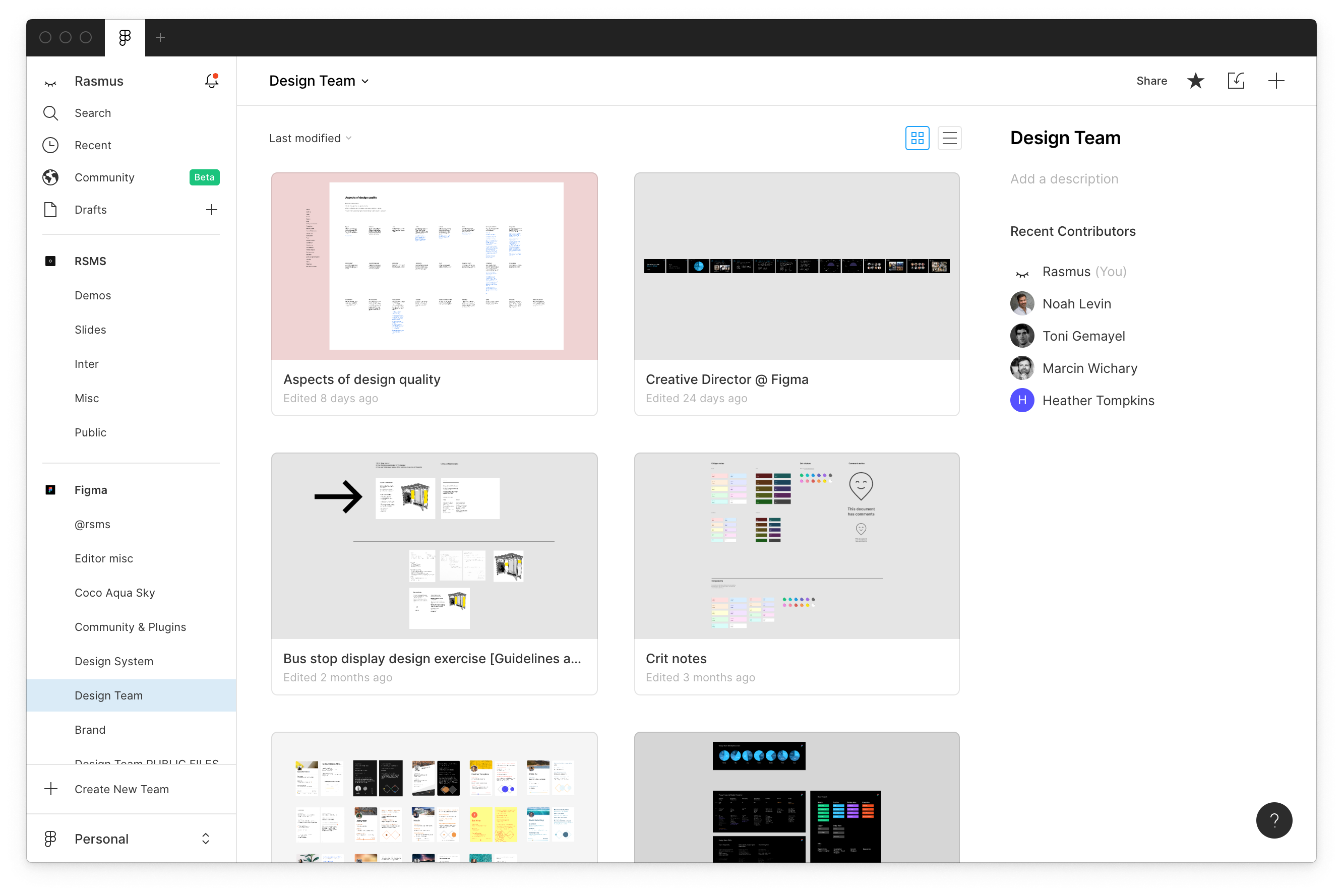
Browser
The browser is probably easier to relate to as it follows a more traditional master-detail layout; master list on the left, detail view for selected section on the right/center.
As the lead designer, or principal designer if you will, my role has evolved over time and as we’ve built out a design team at Figma. We founded a design system shortly after the public release of Figma which is something I continued to lead, in addition to leading design of the editor, until I left Figma. It was truly a team effort! So many people at Figma contributed and helped build the design system, internally called “UI2”.
When I left Figma we had just started work on the next generation of this system, called “UI3” (yeah, we are very creative with naming things, I know.) However what we will focus on here is UI2 and perhaps a bit of UI1. UI2 has been in production for about two years.

UI2 as seen in its Figma document
UI2 is spatially organized with “sheets” for various concepts:


Product development
Large part of my time was mainly spend on product development, leading the design for our editor and figuring out what we should build and how we should build it.
Components
Components was probably my most impactful innovation at Figma. At the time, existing design tools like Photoshop and Sketch had some graphic-syncing abilities at best, but nothing that was usable for composition or even modeling real user interfaces. I took my experience with software engineering and concepts like prototypal inheritance, polymorphic inheritance and composition, and turned that into a question: “how can we leverage the good, intrinsically human parts of those systems for design work?”
The result was a compositional model with a concept of prototypes and instances. The prototype is the source, a regular frame in Figma. Instances are incarnations of prototypes, of components. An instance can—just like in prototypal inheritance models like JavaScript—have local overrides; property values applied “on top” of the prototype’s properties.

For example, as we can see in the GIF above, overriding the color and adding some stroke to instances means that when the prototype (left-hand side in the GIF) changes, everything but those overrides update in real time.
Smart Selection
Smart Selection, internally called Magic Collections, was a really fun project with an origin story that was often retold by colleagues when trying to “sell” Figma to an outsider:
One day after I think an interesting lunch conversation I had an idea that was basically this: What if you could just select stuff and if it is uniform, we give you some higher-level tools right on the canvas for adjusting the layout? Things like spacing and order. I put together a quick set of drawings. I think I spent less than an hour on this and then I posted the idea together with the drawings in Slack, looking for some feedback from my coworkers.
Ryan said something like “oh, interesting…” and an hour later he came over and showed me a working prototype of it, in Figma, with real data!
 Demo of some Smart Selection features
That was one of those moments you’ll remember for a long time, when collaboration just happens and people feel empowered to create. Ryan, myself and a few of our colleagues later built it for real over the course of a few months.
The final version 1 that shipped included some more things we thought of, researched and user tested along the way, including “Tidy up” – a function that attempts to give you a uniform collection of some arbitrary selection, to help you get into a valid “Smart Selection” state
 Demo of “Tidy up”
My design process of these sorts of mainly mechanical features is usually focused on just that: mechanics, ergonomics and logic rather than specific interactions or UI.


Smart Selection design docs
Desktop app
When I joined Figma the company was 100% focused on the web platform and specifically web browsers as the only interface. I had some pretty strong opinions about offering a desktop app, mainly stemming from pragmatism: A desktop app not only gives you a persistent icon on a user’s computer (good for marketing & growth) but it also allows access to parts of an operating system that a web browser can not give you, or would give you a limited version of. For example fonts, clipboard, hardware information, etc.
I took on a side project to build a desktop app prototype so that we could try it for ourselves. I built it in C++ using CEF as that’s how Spotify is built and some apps I worked on at Dropbox, so that felt like the best path for me to get a real working prototype built.
The prototype was a success and it convinced Evan & Dylan, the company’s founders, and several coworkers that a desktop app was a good idea. At the time of writing this in 2020, the majority of people editing in Figma use the desktop app.

It may not seem like much on the surface, but Figma’s desktop app is quite complex. It provides UI statefulness, access to local fonts, exporting directly to the file system with sub-folders, stable file browser UI, accelerated “new file” functionality, plugin development functionality, display color space and much more.
Iconography
Johan Prag and I developed the initial Figma icon set together. When Johan left Figma I kept going. I learned a lot from him working together on iconography. At the time of writing this we have drawn many thousands of icons and have an icon set that I’m proud of.
Conceptually all icons in Figma are based on basic shapes like circles, lines, rectangles and triangles. The way we design and maintain these icons is very similar to how you would design a typeface: as one family.
Standard 32dp icons
The Figma icon system is arranged into five categories:
- Standard (32dp)
- Small (16dp)
- Toolbar (48dp)
- Layer (16dp)
- Special (arbitrary sizes)
All icons are drawn with rasterization in mind and optimized for a 1:2 dp-to-pixels factor as that is the most common rasterization factor (i.e. a 32x32dp icon is rasterized as 64x64px.) However, Figma runs on a very large number of different computers and display hardware which means that icons needs to be arbitrarily scalable.
The constraints within a category are as follows:
-
Size classes — all icons within a certain category share the same size class; its bounding box is the same. The purpose for this is to make implementation more reliable (positioning of an icon is in the hands of the designer, not the software developer) and also aid at design-time with optical size.
-
Optical size — a set of icons is like a set of glyphs in a typeface: they belong together as a family and are usually experiences as such. All icons within a certain category must therefore match, and be visually evaluated alongside, existing icons in that category.
The picture above shows the “Standard” icon set which has a size class of 32dp. The picture here below shows the “Small” category with a size class of 16dp:
Here are icons in the Toolbar category:
And here are icons in the Layers category:
Design Principles
I helped the company develop a set of principles for guiding the culture, daily work and vision. I did this together with our design team over the course of several years, as developing principles is just as much about learning about & documenting who you are as a company as it is about iterating & improving upon those documented principles. This was also a highly collaborative project; everyone, especially in the design team, needs to feel empowered by these principles and willing to stand behind them and stand up for them.

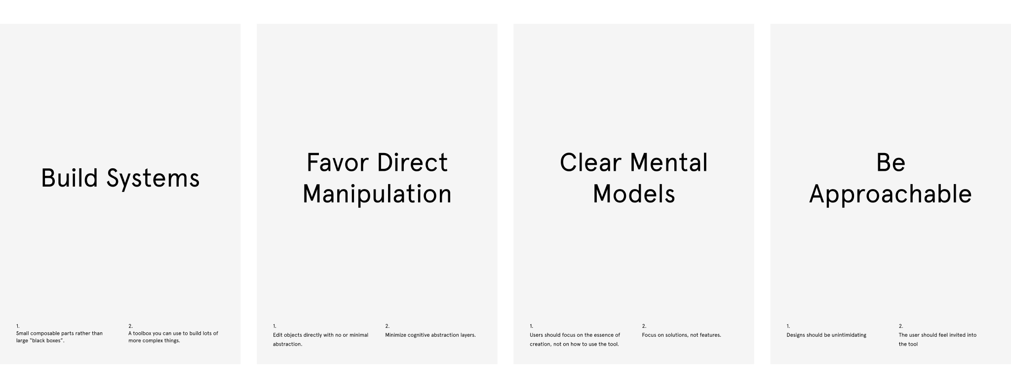
These posters were produced and hung up on the office walls to help remind ourselves about the principles we chosen to live & create by. The current 2020 design principles are as follows:
Professional
Powerful
Design is about finding novel solutions for complex problems. Our tools shape the solutions we are able to explore, so Figma needs to be powerful to allow our users to express any idea they have.
Low barriers, high ceilings.Precise
Figma is a tool for experts and professionals for which accuracy is critical; we need to allow people to be accurate and precise in everything they do.
Useful, not whimsical.Practical, not superfluous.
Systematic
One of the key pillars of building software is the possibility to leverage reusable blocks to build something new and more complex. Computers do the heavy lifting so you can focus on the concept.
Embrace engineering practices.Let the few empower the many.
Approachable
Predictable
When features are added we strive to respect the system, building on users trust and prior experience. When we introduce a new pattern, we do so mindfully.
Superpowers, not magic.Build understandable parts.
Biased toward simplicity
The tool will naturally bend toward complexity, and we'll have to actively work against that tendency. Keep the simple things simple, and make the complex things possible.
When in doubt, leave it out.Favor direct manipulation.
Natural mental models
Our solutions should be based on the way humans think, rather than how computers work. This is to support their intuitive understanding of how the tool works.
Clear mental models.You can describe it to a friend easily.
Thoughtful
Responsible
Figma feels comfortable challenging existing conventions and industry standards, but also learns from others and avoid running in circles.
Challenge status quo.Don't reinvent the wheel.
Solve problems, don't build features.
Detail-oriented
Our tool is built to allow people to express thoughts with precision and care. We should hold ourselves to the same standard, keeping our craft polished to inspire others to do the same. We bring delight with details.
Sweat the details.Strive for delight.
Playful.
Respectful
The attention of our users is precious and we should guard them from unnecessary interruptions. We should not assume, but research and test to understand their true intentions.
Research, don't make assumptions.Time well spent > time spent.
No dark patterns, no manipulation.
Process
Our process was founded in pragmatism with idealistic hopes: We knew the accuracy and performance of these principles would be asymptote, that we would never be completely satisfied. There are two good reasons: What we need, who we are and what we want changes over time, and second, principles are by definition like guard rails: they will never perfectly describe the path that you are taking, but merely provide guidance for it.
Thus, the process goes likes this:
- Learn about who we are, who we want to be, etc
- Expand on this as much as possible
- Reduce down to 3-4 core principles
- Live with these for a while; see how they help us in our daily work
- Revisit, expand, reduce and repeat
Our work started in early 2017. Here are our first set of principles:
We lived with these for about a year before making another iteration. They worked quite well for us and we based our next round of development on the core aspects of these, especially “be approachable”, “clear mental models” and “favor direct manipulation” as those three concepts had been a real practical help for many of us in our daily work so far.
Here are some pictures from what the process looked like:
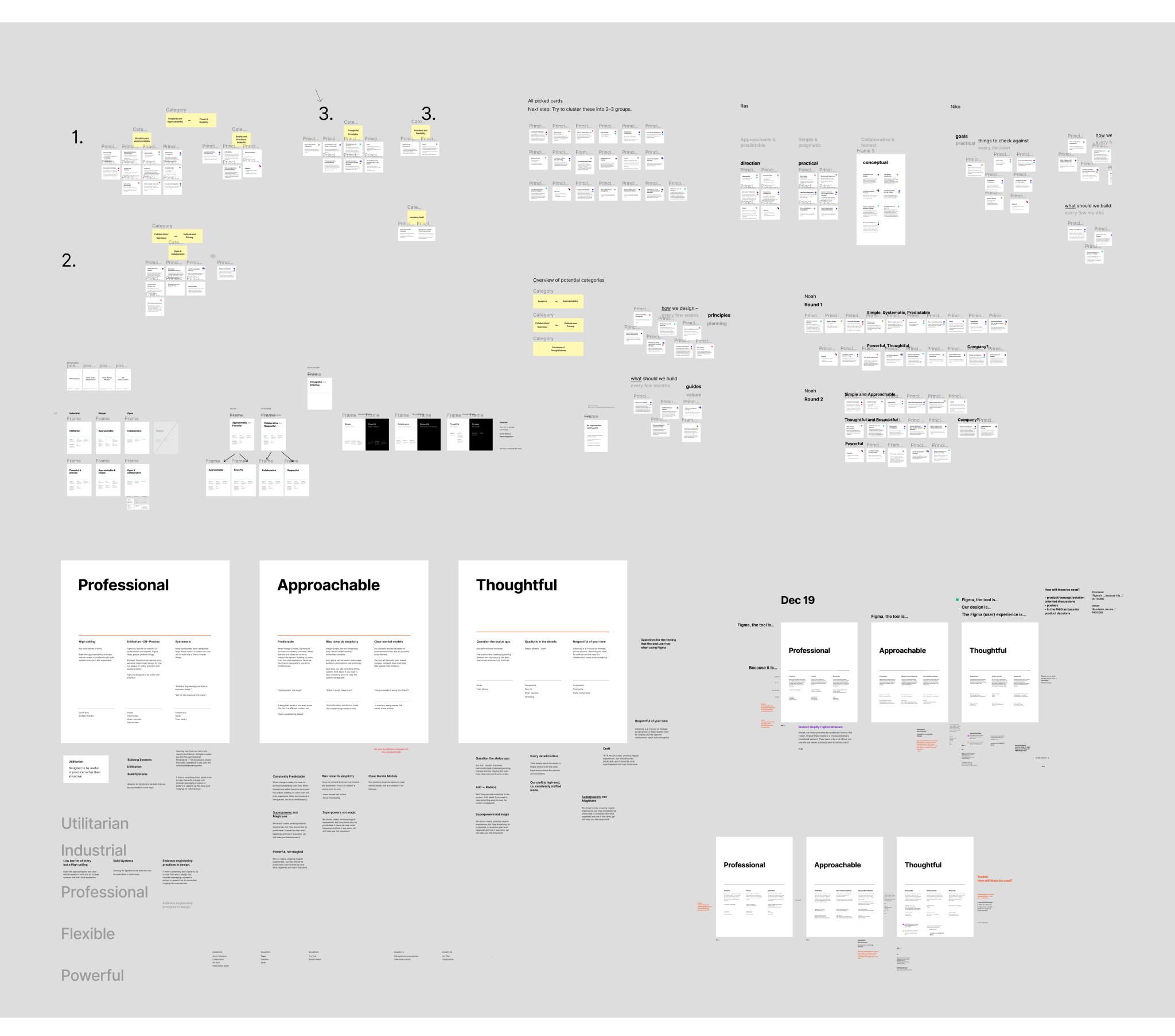
Iterations, brainstorm and synthesis process
Cards used for conversation
All in all, developing these design principles was one of several very satisfying and inspiring projects I had the opportunity to work on at Figma. I found so much joy in seeing these things directly help my coworkers & friends, and I had a blast conversing and thinking about these things.
Another thing I enjoyed during my time at Figma was to make things, in particular posters. Perhaps unsurprisingly, there was a genuine interest in graphic design amongst colleagues.
Here’s an example: For the Figma Plugins launch we held an event at the office, inviting all the beta-phase plugin developers from around the world who had helped test the feature and build the first ~50 plugins. I put together a poster listing all plugins they had created, put it up on a big easel in the event space and asked everyone to sign their name.

I framed it and hung it up in the office just next to the engineering team working on the plugins feature. I’d often see people—visitors and colleagues alike—stopping by the wall and looking at it for a little while. That always warmed my heart.
I could go on an on here about other projects like this, but I fear I might have already lost you in my long ramblings, ha ha.
Culture
Every company has its own internal personality, its own culture. Figma is no different. In fact, Figma has the most wonderful culture of any company I’ve experienced so far in my 20+ year long career. From very early days the company—a group of people which really feels like a family—managed to build a very sensitive, humane, all-inclusive and warm-hearted culture.
If you ever had the chance of visiting Figma over lunch, you probably experienced one of its cultural hallmarks: Communal seating and everyone eating and having conversations together:
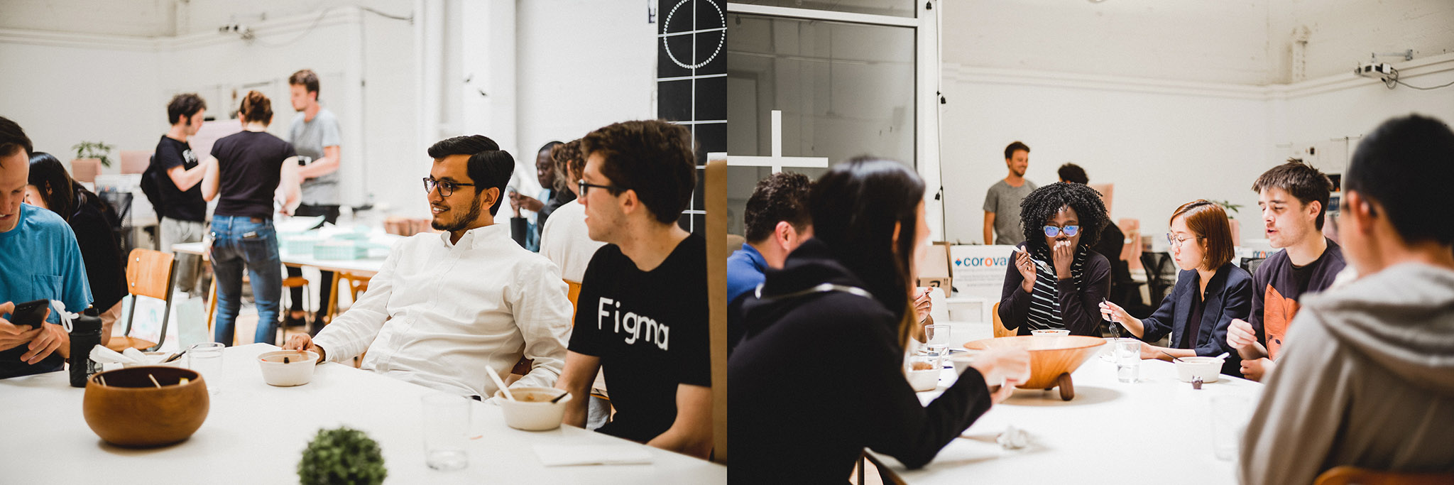 Communal lunch
Rather than small cliques of people going out for lunch, or even people eating at their desks, we all took a break in the middle of the day to sit down, have a conversation, share something interesting. I think that I have had some of the most interesting conversations of my life at these lunches.
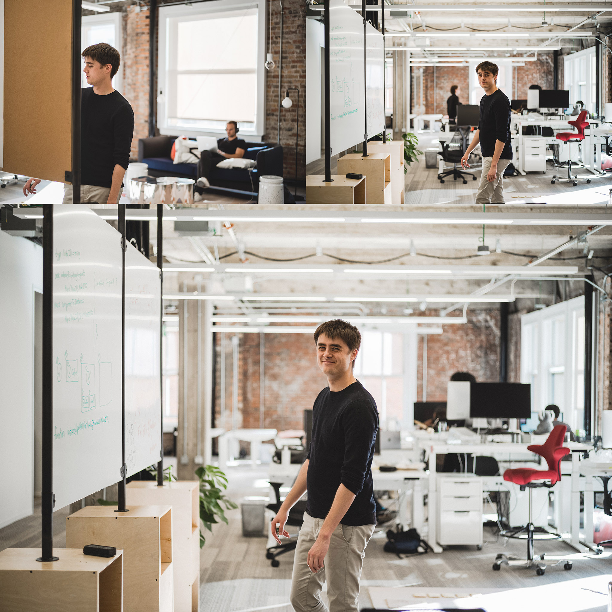 Jamie in the office thinking something through
In the office and during COVID over Slack & Zoom, there’s this feeling of exploration and curiosity. Sometimes I’d take a cup of coffee and walk around, which often meant I’d stumble into someone else who was thinking about something and inviting me to elaborate. Every subject you can imagine, from novel data structures and kernel models to ideas about human consciousness and why cats paint (or why to paint cats.)
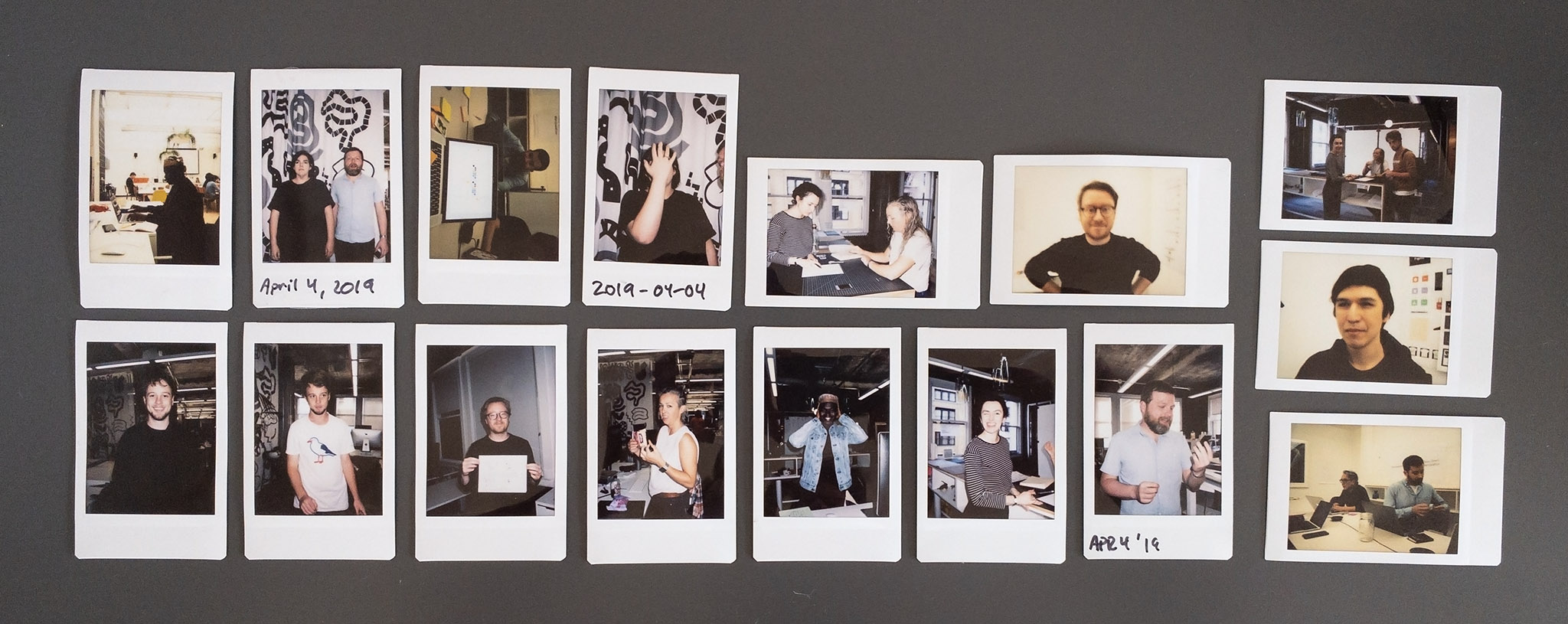
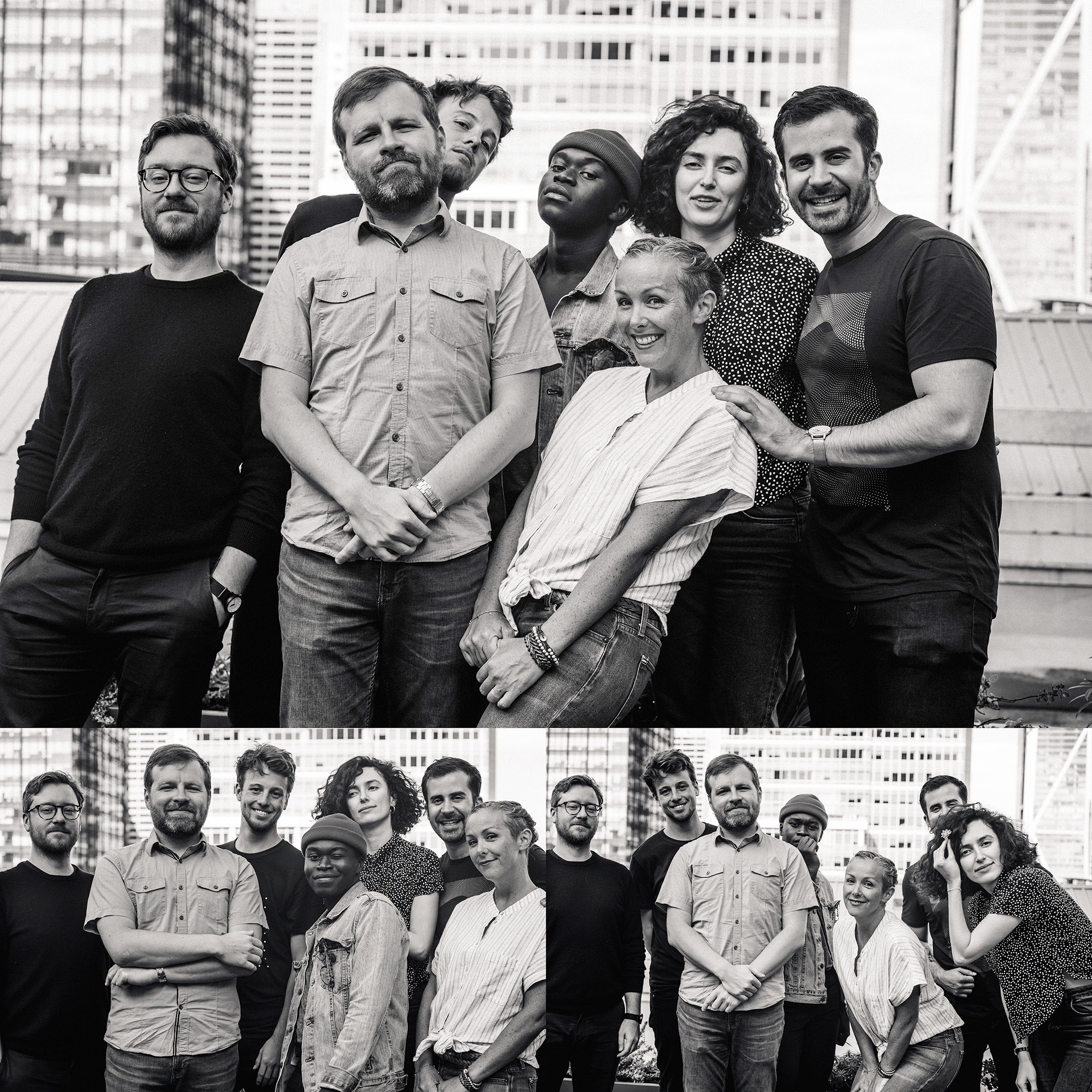 Part of the Figma Design Team
Our design team was a collection of really amazing people. I learned so much from so many people.