Traffic lights are dancing
Recently Apple released the App Store for Macs (that is, a way to distribute and purchase applications in OS X). The App Store application has received a lot of criticism — both for it’s initially buggy technical implementation but foremost for the non-standard and “off-Apple” style user interface.
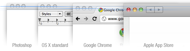
The probably most discussed topic surrounding its UI is the rather radical moving of the window control buttons aka “traffic lights”:
Now, from a purely aesthetic perspective this was a fairly good move as the “traffic lights” align nicely with other parts of the window header to create visual balance. But interaction design is not art, it’s rather closer to “architecture”.
A well-designed human-computer interface is a winner if it ultimately helps the user to achieve what she is trying to accomplish with minimal effort (from her part). This statement does not discard aesthetics as an important factor nor does it imply aesthetic as having anything to do with the success of interaction design. Aesthetic help in most cases but does not alone accomplish the above statement, or “goal” if you will.
Let’s get a little more concrete in our explanation of the problem with moving these “traffic lights”. In the following illustration we compare the “hit area” (the active area in which you can click) for the window close button, based on the OS X standard position.

Now, you might think “Hey, I have eyes! I can see where I click.” which isn’t a false assertion, however—and in fact—most things you do are executed through spatial memory rather than by purely visual aid. That is, you learn where to click and you stop looking.
This is a key concept in interaction design: Minimize cognitive load.
In a system where e.g. a window close button has a fixed position in a window (area) your brain is very good at translating your spatial memory of where that close button is from a sort of “relative” memory into absolute coordinates on the screen. Our brains are very good at these kinds of things, so they are a versatile tool in the field of interaction design. So by moving around the “traffic lights” you force the user to employ visual aid when about to use the “traffic lights”, which in turn drastically increases cognitive load.
In my opinion, the “traffic lights” are a set of highly standardized and widely used UI controls in the Mac OS environment and should also have strict standard screen locations and behavior.
Is this really so ugly (it’s a bit ugly I must admit) that making it (aesthetically) prettier is worth the price of lowering the user’s performance?

Respected Mac-sphere writer John Gruber states:
In Mac OS X, Apple began experimenting — especially in their flagship apps. Whether this change has been for better or for worse is certainly debatable, but there can be no debate that the mores of Mac UI designers have changed. Apple sets the tone, for better or for worse. Always has, always will.
I guess he’s right. Historically Apple has set the direction for the Mac OS user interface, but ultimately the community (e.g. we) decide what flies and what doesn’t. For starters, the Chromium team responsible for user experience should follow and help maintain the OS X standards and revert into standard “traffic lights”.
And then there’re the fugly App Store and iTunes icons, but let’s save some anger & frustration for another day ;)