Why the OS X Menubar should be dark and not bright
The OS X Menubar is that light-grey thing stuck to the upper edge of the screen. It’s stationary (with the exception for “fullscreen” modes) and thus is always visible. The Menubar is one of the core concepts of OS X’s UX which I really appreciate and which makes it hard to use OS’es which have one menu bar for each window.
Anyhow, the thing is always there and it’s bright. So what?
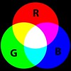
 Computer screens follow the so called additive color mixing rules (technically “optical mixing”, but the concepts are the same) where adding more color and intensity creates a brighter color. Mixing all colors (reg, green and blue) with maximum intensity yields the color white while “not using any colors” yields the color black.
What this means is basically that black on a computer screen is the most calm and low-intensity color while white is the most vibrant and intense color possible. From a purely logical perspective, computer software should be white text on dark background, but in reality that sort of mixture often induce a dull and “technical” feeling. Everything is in balance thus IMHO the key lies in not over-using white nor black. There are many more aspects to this discussion, like actual and perceived contrast when using different mixes of white/black or black/white, but we’ll save that for another day.
For a long time I’ve been of the opinion that the Mac OS X Menubar should be black instead of a bright grey color, since:
-
It sits on top of the screen at all times and thus have little or no need to provide visual cues for where it is currently positioned or what it’s doing.
-
It’s a peripheral user interface component – something you only place your eyes at when looking for some specific information, or call it a “passive area” if you will.
-
Three of its four edges border to black areas (the edges of modern Mac computer screens have a black glass finish), so there are few or negligible contrast issues with potential brightly colored neighboring areas.
As I see it, there’s no sturdy logical or “concrete” argument for using a light-grey colored menubar except from a possible Apple user study suggesting many people like bright backgrounds. However, I doubt such a user study – if it was ever done – would be viable today and if one would be carried out today, how would you subtract the “background radiating influences” of most OS UI’s where backgrounds are usually white with black text?
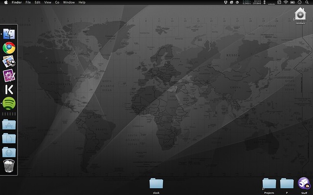
So yesterday, while having some kind of weird hack-slack-and-semla evening with my friend Oscar, I decided to hack OS X in order to achieve a black-with-white-text Menubar. Now, I’m not a big fan of hacking things which aren’t meant to be hacked (like modifying proprietary binary blob resource files in the OS X Window Server). I gave up and are now instead using Nocturne – a neat little app which simply inverts the colors of the Menubar. This is what my desktop looks like now:
Focus on essentials rather than peripheral functionality.
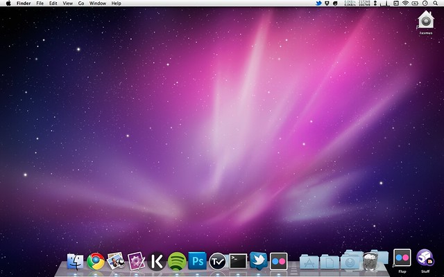
Here’s what a (more or less) standard OS X 10.6 desktop looks like:
I believe the next version of OS X (10.7 aka “Lion”) will feature a black Menubar, or even no stationary Menubar at all but rather one that slides down when the mouse or finger comes close to the upper screen edge, almost like the Dock when hidden.
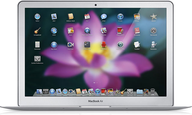
iOS has gotten a lot of attention and some of the really good UX and UI people at Apple has moved to or otherwise become part of the iOS HI team. For better or worse, OS X 10.7 is likely to have many iOS user interface ideas incorporated, like the fugly Launchpad revealed at Apple’s “Back to the Mac” event last October:

Notes & references
-
The wallpaper in the first screenshot can be found here: world-map-wallpaper.png. And here’s a special version which cancels the shadow and provides a blacker menubar: world-map-wallpaper-1440-black-top.psd. It’s a composite created by me but the sources are the OS X 10.5 standard wallpaper combined with a modified SVG world map w/ timezone info released in the public domain.
-
I must admit that I actually did do some very light hacking of the Menubar; namely changing the fugly shiny dark apple with a plain black one so to achieve a clean “glyph-like” white one when using Nocturne. For this, I used ThemePark and simply created a new PNG in Photoshop which you can grab here: http://hunch.se/stuff/plain-black-apple-icon.psd (I release this little creation in the public domain).
-
Icons on the right hand-side represent (from left-to-right): Nocturne, Dropbox, Droplr, MenuMeters and the rest are standard Apple stuff (character viewer, wifi, and so on).
-
Contrary to what the first screenshot suggest, I keep my Dock hidden and use Spotlight for launching apps.


