My take on Firefox 4
In the fast-paced world of web browsers Mozilla Firefox owns the second largest market share. Yesterday the much anticipated version 4 of Firefox was released and these are my reflections. I’ll mostly be comparing Firefox 4 to Google Chrome 11 on Mac OS X, since that’s what I use day-to-day.
Startup time and general UI responsiveness
Firefox has traditionally been the “slow one” on Mac OS, mainly due to heavy disk I/O and CPU usage as an effect of the XUL technology and other tech details, like the absence of a font cache in earlier versions. Firefox 4 feels much more responsive than Firefox 3.6 (the previous version), but is still relatively slow to start when compared to Safari or Chrome, both which are native applications that don’t need to parse a ton of XML when they start (like Firefox does).
This is a minor issue and somewhat subjective.
Windows & tabs
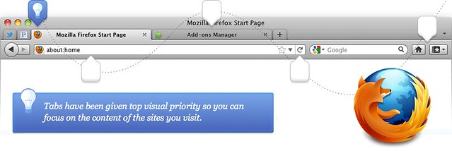
As with most modern browsers, multitasking in Firefox is based around a tabbed user interface. The window of Firefox 4 looks like this:

Like Chrome, tabs have a maximum width and will uniformly shrink (horizontally) when more room is needed for new tabs. However, the window header feels rather large and a bit clumsy. Compared to Chrome, it’s actually just a few pixels higher, but the tabs in Firefox are smaller and the window contains the current tab’s title.
Since most people using these web browsers use a mouse or trackpad to navigate tabs, having small tabs (and thus hit areas) is a bad idea since the user will have a harder time hitting the right tab. Mozilla (the creators of Firefox) probably decided to make a compromise on the size of the tabs in order to fit a title into the window header, something that Chrome lacks.
I personally don’t believe in long and descriptive window (or page) titles in this context. They tend to be a mere repetition of a (in most cases) better and richer title displayed in the actual website. I would rather see that Firefox went down the same lane as Chrome and Internet Explorer 9 and skipped the window title. Something like this:
Update: Abhijit Shylanath pointed out that removing the title bar is possible in the Microsoft Windows version of Firefox 4.
Some details related to window UX where Firefox 4 got it right but Chrome fails:
-
The “traffic lights” (close, minimize and zoom) window controls are correctly positioned. Thank you Mozilla. Related: “Traffic lights are dancing”
-
“Jump-to-here” scrolling works (it’s broken in Chrome as of version 10.something) and Firefox 4 correctly obeys the system/user configuration (you can choose between “Jump to the next page” and “Jump to the spot that’s clicked” in System Preferences)
-
“At top and bottom” scroll bar buttons appears correctly when chosen by the user in System Preferences. Chrome overrides the user’s setting and always display them “together”.
Closing tabs
A really nice feature in Chrome is how you can quickly close a bunch of tabs because of how tabs align. Basil Safwat has a good write-up about this. I expected Firefox 4 to sport the same nifty UX after reading “Making tab closing as easy as click, click, click”. But no.

Mozilla are already on to this which appears to get fixed til the next release. (Thanks to Erik Möller for the tip).
Switching tabs
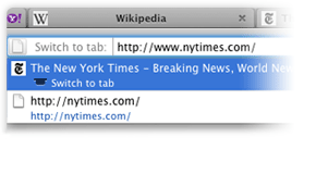
A really neat feature, new in Firefox 4, is the ability to switch to already open tabs by simply typing in (partially matching) text or url into the location bar.
Update: There’s an experimental feature in Google Chrome 11 (and newer) which can be enabled to provide similar functionality. Visit about:flags and enable “Focus existing tab on open”.
Developer’s console
The interactive console primarily used during website development is called “Web Console” in Firefox 4 and — unlike Chrome, Safari and previous versions of Firefox — it appears on the top of the window rather than at the bottom. Albeit still in a split-screen pane.
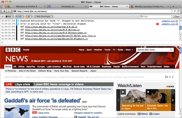
The position of the console is probably mostly a matter of taste. However, this “Web Console” is much simpler than the one found in Safari and Chrome as it only provides an interactive JavaScript console and event log. The console found in WebKit browsers features a broad set of different kinds of developer tools, including script debugger, network monitor, DOM inspector, etc. These features can however be added to Firefox by installing various extensions.
A big downside with the “Web Console” in Firefox 4 is that it dramatically slows down the loading of any website (feels like a factor of 5).
System integration
Any modern computer system (i.e. operating system, applications and settings) is a carefully balanced circus act. You have color calibration, text input, language dictionaries, UI behavior, etc. — all shared between applications to provide an intuitive, low-barrier and powerful user experience.
 Unfortunately due to how Firefox is built (it’s like it has its own little operating system which runs the actual app), system integration is relatively poor.
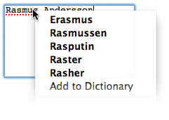
For instance, Firefox is unable to use the user’s spelling dictionary. If I open up an application (for instance TextMate or Pages), write some text and the spell checker finds a word it doesn’t recognize, e.g. my name “Rasmus”, I can tell it that “This is a correctly spelled word, please learn it” and all other applications will later know how “Rasmus” is spelled. Except for Firefox which uses its entirely own spelling system. This means that, like in the screenshot to the left, you will need to teach the Firefox spell-checker and fill the Firefox spelling dictionary from scratch.
This is how the user’s spelling dictionary (shared among all apps, but not supported by Firefox) works:
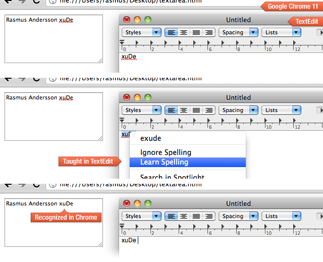
Although Firefox 4 fails horribly on integrating with the shared spelling system, it does get it right with word dictionary lookups (Ctrl+Cmd+D by default), correctly showing the dictionary word-pop-over. Chrome does not show this pop-over, but instead launches the Dictionary application, relieving Chrome itself from user input focus (a bad thing). Update: This will likely be fixed in Chrome 12 (thanks to Christopher Berlusconi Quackenbush for the tip).
Another relatively irritating lack of system integration is dragging stuff from Firefox to e.g. the desktop. When you drop something it will not appear where you dropped it, but rather added to the default location (somewhere on the rightmost part of your desktop). I tend to use my desktop as a landscape of semi-temporary piles of documents, visually grouped. Using Firefox, I must re-position the file each time after I’ve dropped it on the desktop. Tedious and definitely unnecessary.
File selection/opening
An excellent and very useful feature in both Chrome and Safari is the ability to drop a file onto a <input type="file"> input control:
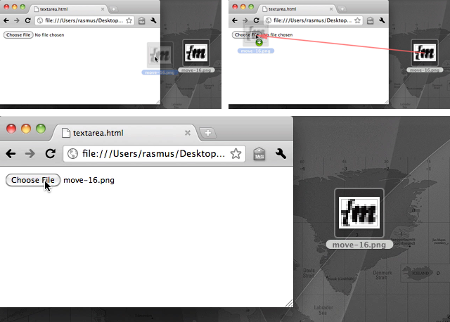
Unfortunately, this is not possible in Firefox 4. In fact, if you try to drop a file on a file control, Firefox will replace the whole website by browsing to the file you dropped, effectively causing any unsaved data to vanish into the void of interwebs (i.e. text typed into a form).
Also, Firefox uses a new window when browsing for files rather than the OS X standard “sheet” display (according to the Apple HIG and Apple’s own products). Here we see Google Chrome (left) displaying a standard OS “open file sheet” and Firefox (right) opening a new window (with a mysterious “Hide extensions” checkbox which did nothing when I checked it):

The problem with displaying a new window is
-
There’s no apparent attachment/link between a web page’s window which requests your attention to select a file.
-
The position of the “open file” window is not visually synchronized with the calling web page’s window, thus leading to a higher cognitive load for the user.
Miscellaneous
When quitting (terminating) Firefox, the state of tabs and open windows is saved, but when later starting Firefox the previous state is not restored. To restore a previous state, you have to manually select "History" → "Restore Previous Session" in the main menu. Edit: This is possible by setting “Preferences” → “General” → “When Firefox starts” to “Show my windows and tabs from last time”. I much prefer how Chrome does this — automatically restore any saved state at launch. This makes restarting Chrome (when restarting the computer or upgrading Chrome) and later resume your work less of a pain.
When dragging around tabs you don’t see what you are dragging. Instead, an image representing part of the contents of the tab is used for the “drag image”. There’s also no feedback (except from a tiny blue “insertion arrow”) when moving a tab to a different position in the same window. Both Chrome and Safari follow OS standards and display a visual replica of the object you are moving — a full tab with all its GUI parts. When moving a tab around you also get instant feedback as other tabs rearrange themselves, backed by an aiding animation, to give you a hint of where you are about to place your tab.
Now what?
Although Firefox 4 is a clear improvement over the previous version, it’s not the ultimate sports car you’ve been dreaming about taking to the streets. If you are hooked on some of the many extensions available for Firefox which does not exist for Chrome, stick with Firefox. Otherwise I recommend you go with Google Chrome.
